Redesigning the Visa Consumer Portal
Click to Pay, an EMVco standard for online payments, is meant to do for ecommerce what contactless payment has done for in-store checkout: be faster and more secure. Managing this feature, had been anything but.
Before 2019, each major card network had its own online checkout solution. Visa's was Visa Checkout.
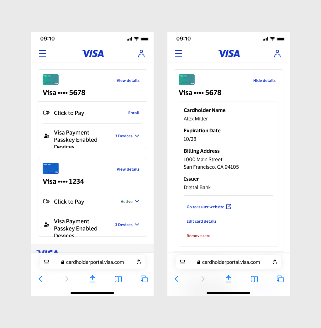
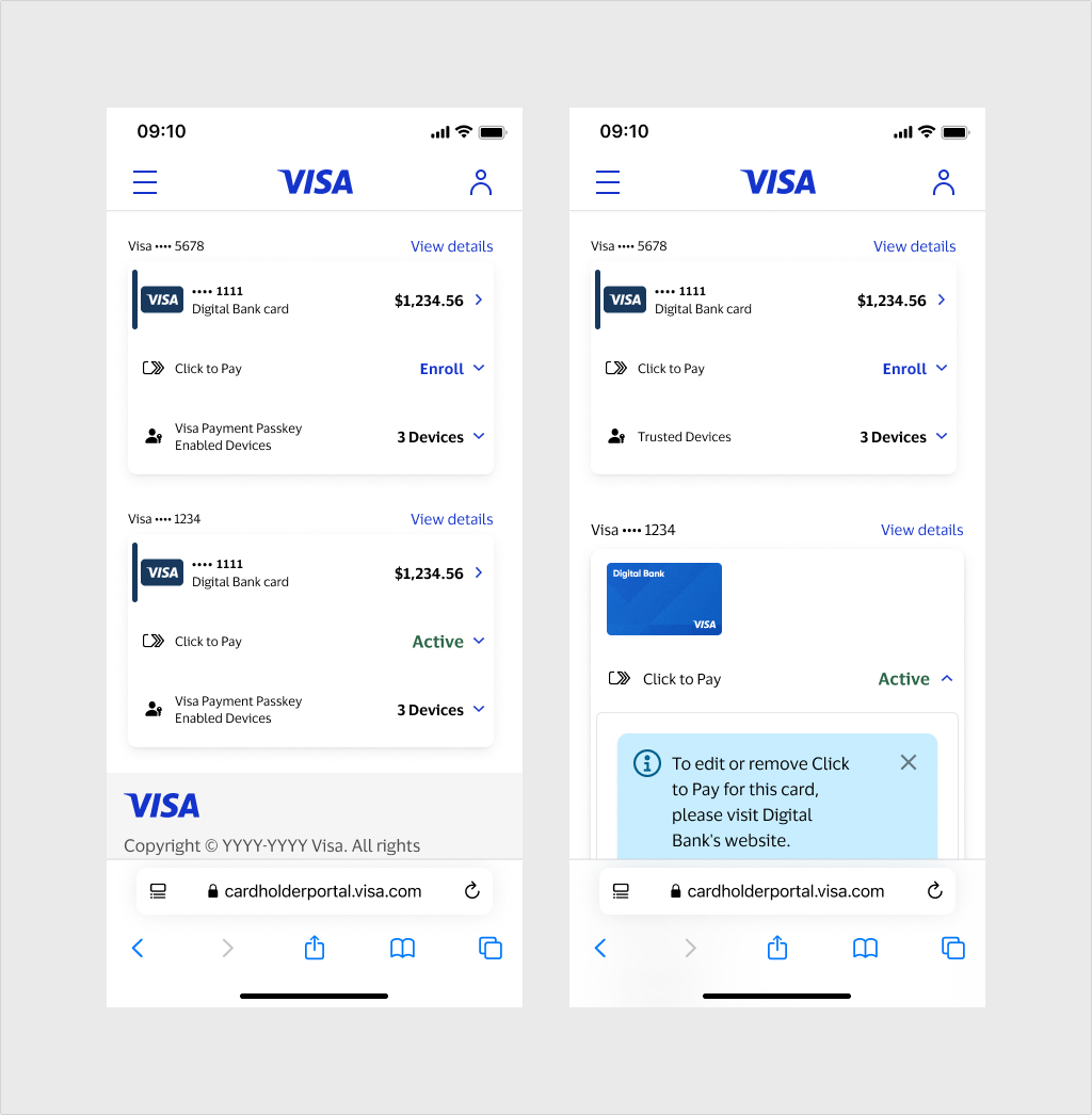
The consumer portal for managing Click to Pay — internally known as the Destination Site — had remained unchanged since 2019, having only received brand refresh.
Over time, issuing banks were expected to takeover managing Click to Pay as a card feature in the same way as they do Contactless. By 2022, that transition still had not occurred, and the Destination Site was showing its age.
The Destination Site's dated architecuture made implementing new features difficult due to its custom front-end and non-modular architecture. A lack of insturmentation also meant we had very little quantitative user data.
Previous designers had explored a reskin, but engineering flagged that the scope would require significant back-end work that couldn't be prioritized at the time.
In the meantime, started studying registration flow so that we could support stronger identity verification and new technologies including passkeys.
By early 2024, new features dependent on the portal had gained priority. A complete redesign became necessary.
I worked with my Product Manager to outline our objectives:
- Adopt Visa's current design system to for brand cohesion and improved accessibility
- Re-envision the siteas a flexible, modular framework that can scale over time
We also had some limitations to start off with:
- Engineering capacity and prioritization were still unclear and to be determined
- We had limited quantitative data due to a lack of instrumentation, and our design research team was unavailable in the near-term.
Due to the lack of data, I started by breaking down the key data objects users interact with and how they relate to each other.
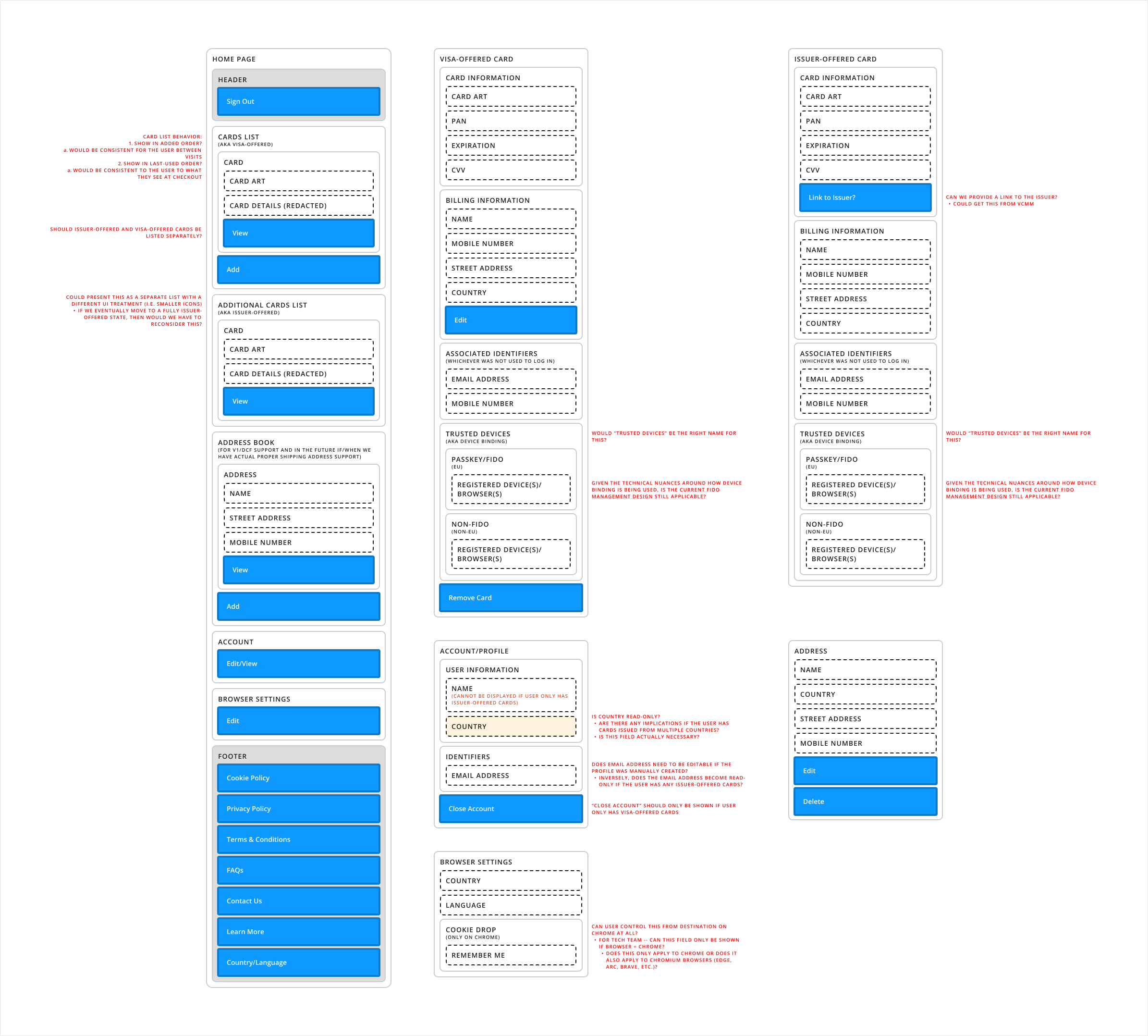
I used that data model to draft multiple information architecture models to ground early design decisions in heuristics and principles.
About a month in, we learned that the team working on Visa Payment Passkeys was planning its own cardholder-facing site.
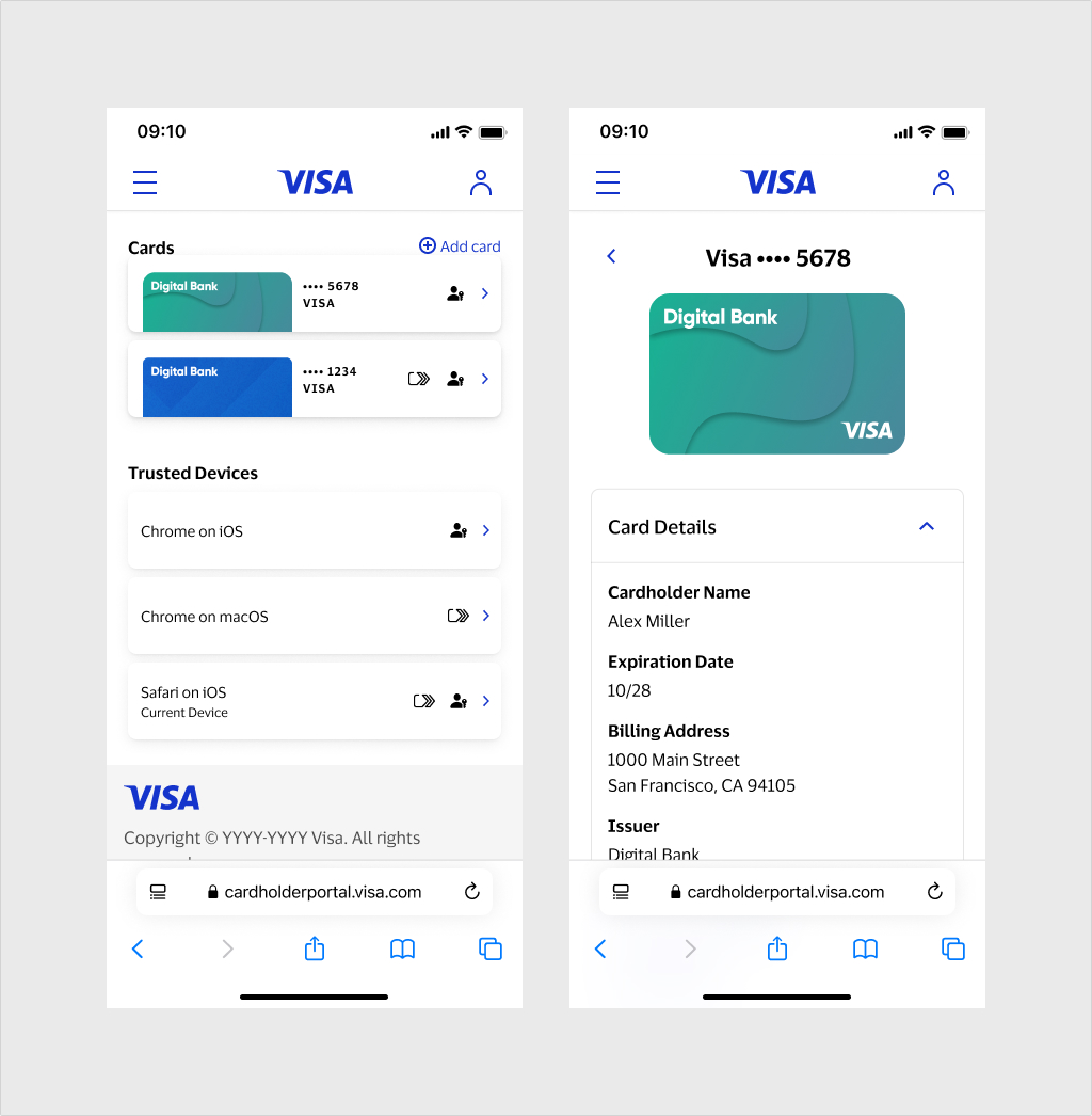
Rather than shipping two separate portals for managing Visa card features, we decided to pursue a single unified experience: the Visa Consumer Portal.
The Passkeys designer and I audited both projects and worked with our product partners to plan a path forward.
This introduced new complexity:
- Click to Pay’s backend was outdated — significant changes were out of scope — while the Passkeys backend would be entirely new.
- A third product handling marketing opt-in was also in scope, but that team’s involvement was still uncertain.
We evaluated two paths:
- Build a single site that bridges data from two separate backends in the near term, or
- Launch two separate portals with a shared design language, with the option to consolidate once Click to Pay’s backend was modernized.
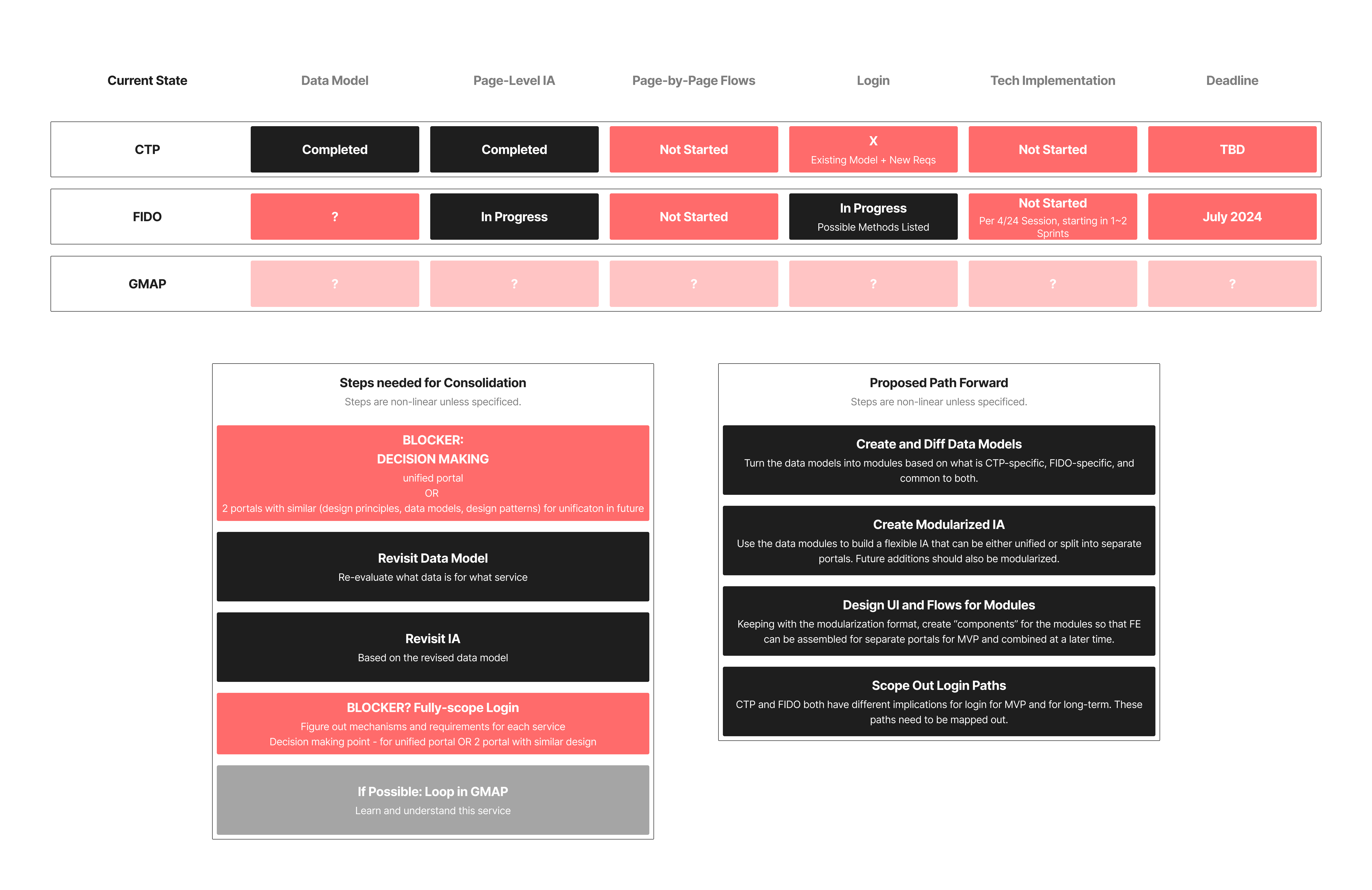
The biggest constraint was time: the Passkeys portal had to launch in August, with engineering starting in early June.
These conversations were taking place in mid-April, giving us six to eight weeks to deliver designs to engineering.
I mapped the next eight weeks into two-week increments, starting with high-level alignment where amgibuity was the greatest.
To establish a shared mental model, I led the group through the same data-object and IA exercises I had used for the Destination Site redesign — this time covering both Click to Pay and Passkeys.
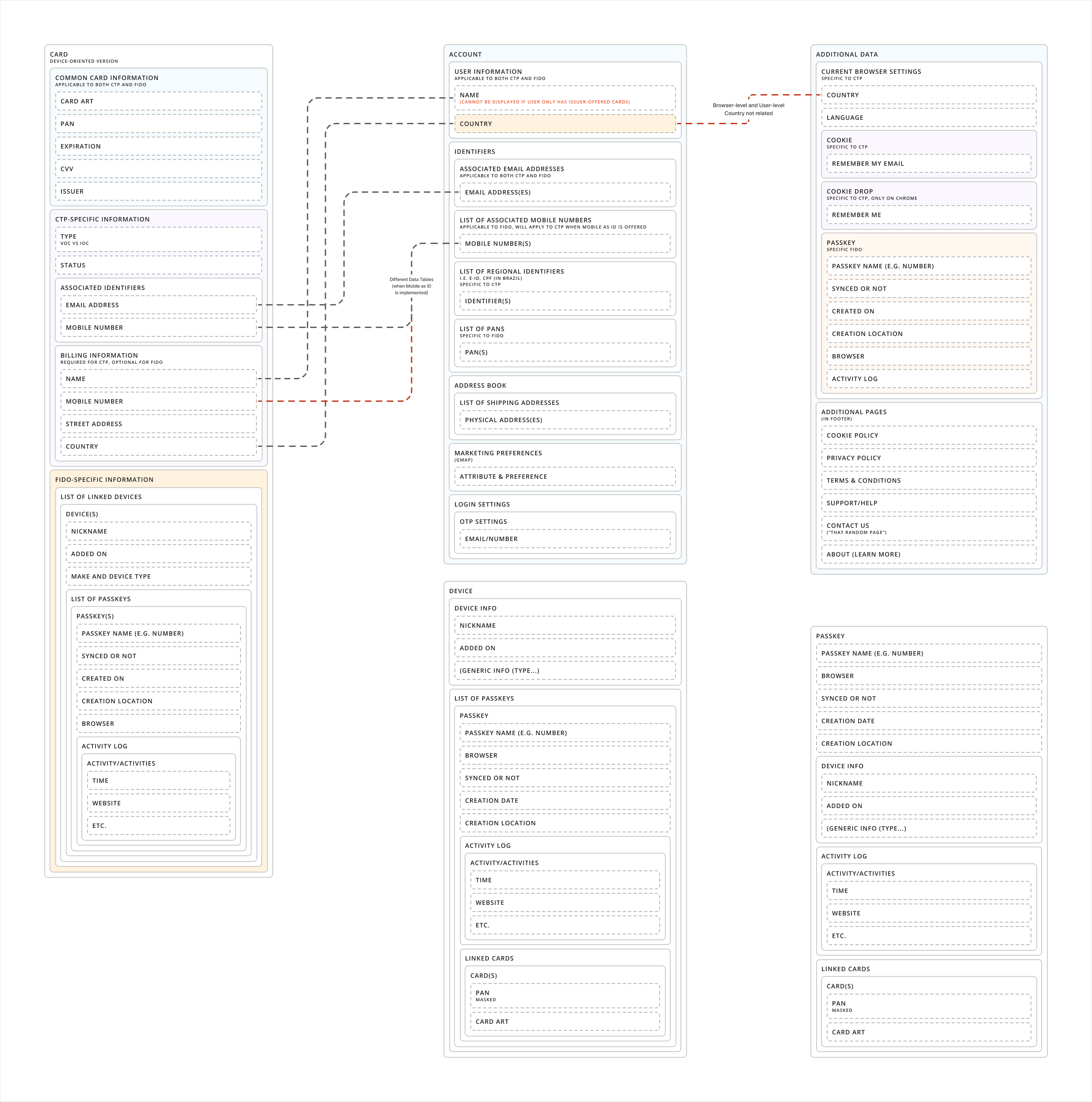
Mapping data objects across both Click to Pay and Payment Passkeys for one shared IA.
Two different IA explorations for the unified portal, iterated through peer and stakeholder feedback.
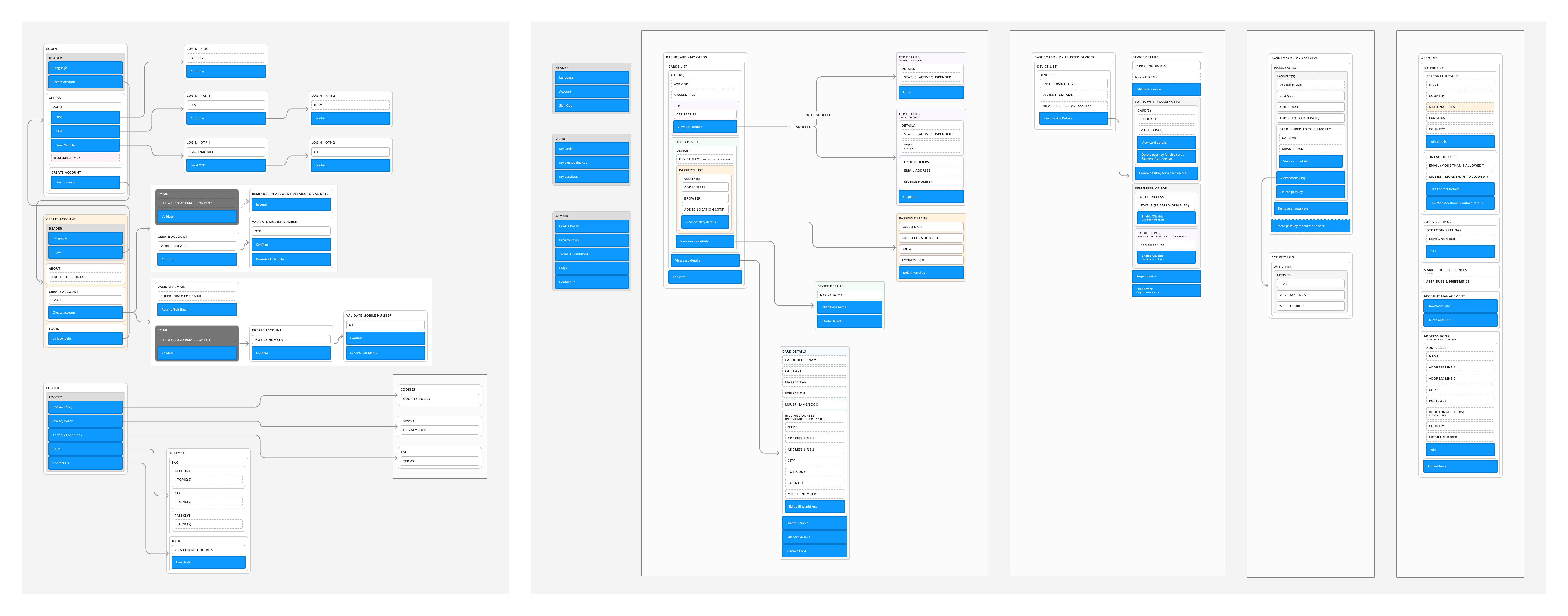
With architecture aligned, we moved into UI exploration.
We produced several layout concepts for the home and card views and refined them through regular critique sessions.
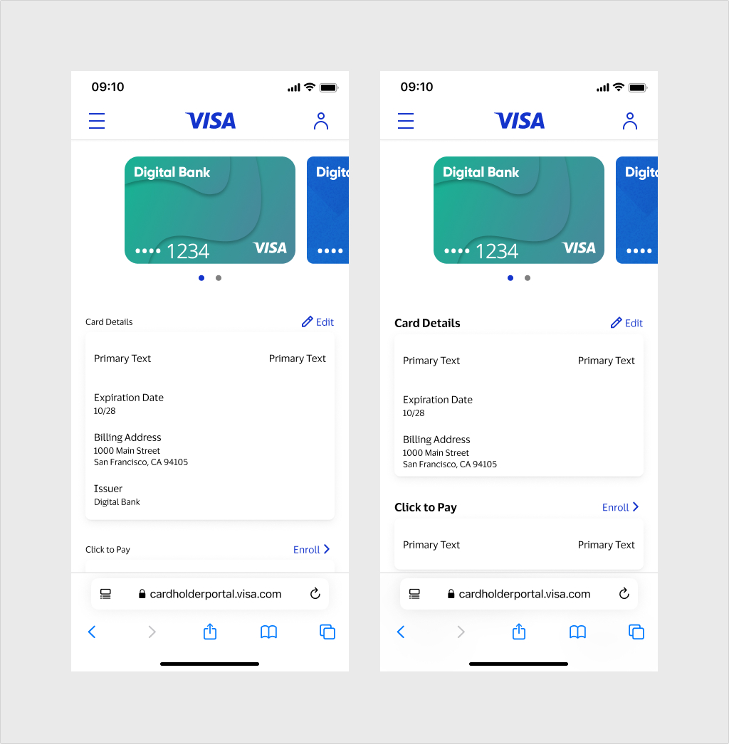
We provided an initial handoff to engineering so they could begin scoping their work.
We aligned on a single modular page architecture to support building separate portals with the ability to deliver a single unifed experience down the line.
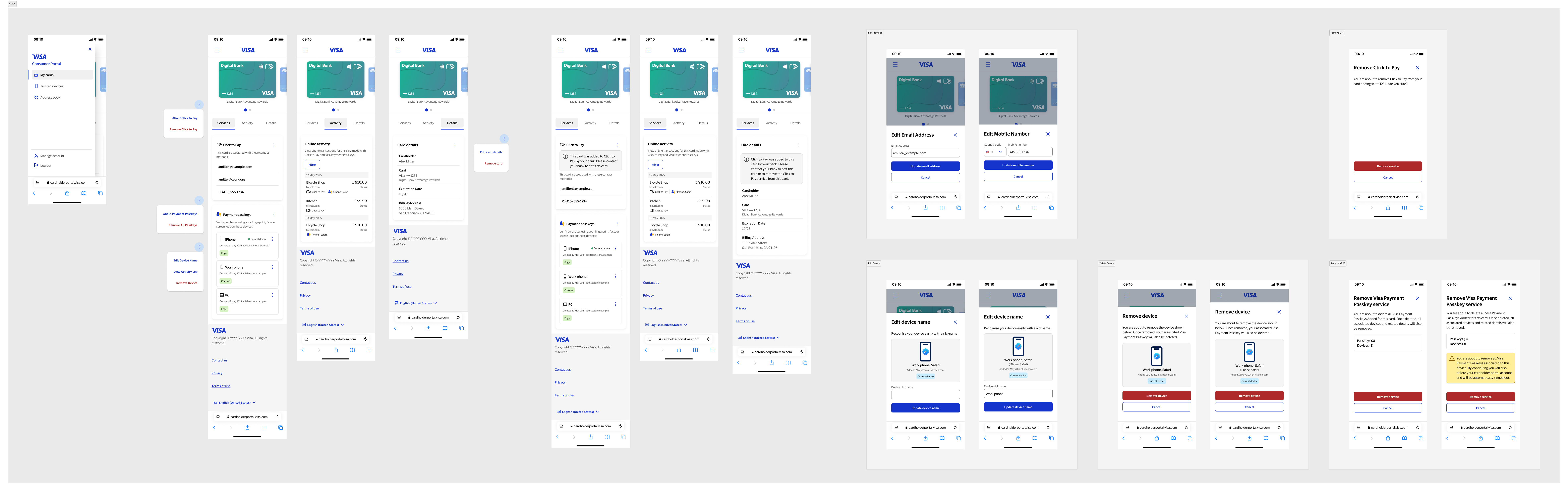
The redesigned Click to Pay Consumer Portal eventually launched in June 2025.
The modular framework, built upon a new design and front-end architecture, has made it significantly easier to add new functionality and accelerate tokenization of payment credentials, increasing speed and security for cardholders worldwide.